Drupal DC Metro Stop Design
Larger version here.
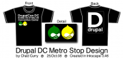
Design adding some local flavor. This is an homage to the Metro station sign for the Convention Center. The back is a 'look-alike' of the Metro logo.
Done in Inkscape. Font is MG Open Moderna.
1 Comment
This is very DC
At least to me. Perhaps one of the druplicons should be blue.