DC Crisp

Check out the Large Image Version
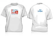
A crisp DC-style design, simple front design with "DC" red on Drupal blue ( red also highlights the DC 2009), with a cool drupal logo on the back.

Check out the Large Image Version
A crisp DC-style design, simple front design with "DC" red on Drupal blue ( red also highlights the DC 2009), with a cool drupal logo on the back.
12 Comments
This is the best design. View
This is the best design. View the larger version. Can I take back my votes on the other shirts?
MJ
I like this design except for...
The back Drupalicon looks a little odd to me.
What about swapping it with either something very simple like the wording
drupal.org
up near the neck or maybe the backside of this other shirt?
http://dc2009.drupalcon.org/t-shirt/its-all-business
I like this one too:
http://dc2009.drupalcon.org/t-shirt/drupalcon-dc-t-shirt
Swapping the back
JRedding, I really like your idea about swapping the back with the its-all-business shirt
vote for this one!
vote for this one! http://dc2009.drupalcon.org/t-shirt/dc-takeover-please-view-high-rez#com... It's way better than these uncreative rags.
It'd be nice if it came in
It'd be nice if it came in grey, not white.
The back
Personally I love the back - it's an idea that hasn't really been explored before - the reverse druplicon. I don't see what looks odd about it.
best overall
this is the best overall. . . something everyone can like :)
Eh
Very dull and lifeless.
meh
What insignia said; very boring
Thanks everyone
Thanks for the votes people. Appreciate it!
nice
Really like this one ! Nice one!