E pluribus Drupal
"Out of many, Drupal"
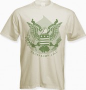
Check out this bad-ass eagle. He’s ready to kick your ass if you don’t love Drupal. His banner says E. Pluribus Drupal and he looks like money!
Inspired by The Great Seal of the United States.
Vote this up if you want to look like a $1,000,000!
Close up of the design here.
Design: Canary Promotion + Design
3 Comments
Text on the banner - E. Pluribus Drupal
The full text on the banner is "E. Pluribus Drupal" and it's the color of $money$.
What more could you ask for?
Where's Druplicon?
I quite like this one, except for the distinct lack of Druplicon. The theme is great ("From many, Drupal"), but it doesn't "look Drupal".
its in the shading
the background behind the eagle is in the shape of the druplicon, and the basic concept of the drupalcon logo has replaced the US flag on the shield. if you take a look at the close up and it should be a little easier to notice.
when designing the shirt, we intentionally tried to stay away from such an obvious use of the druplicon, especially since the guidelines (http://dc2009.drupalcon.org/tshirts/guidelines) do not specify anything other than it be "drupal inspired". as you may have noticed, this site is not using it either!
thanks for your comments.